Shopify Conversion Rate Optimisation: What Makes a Landing Page Actually Convert

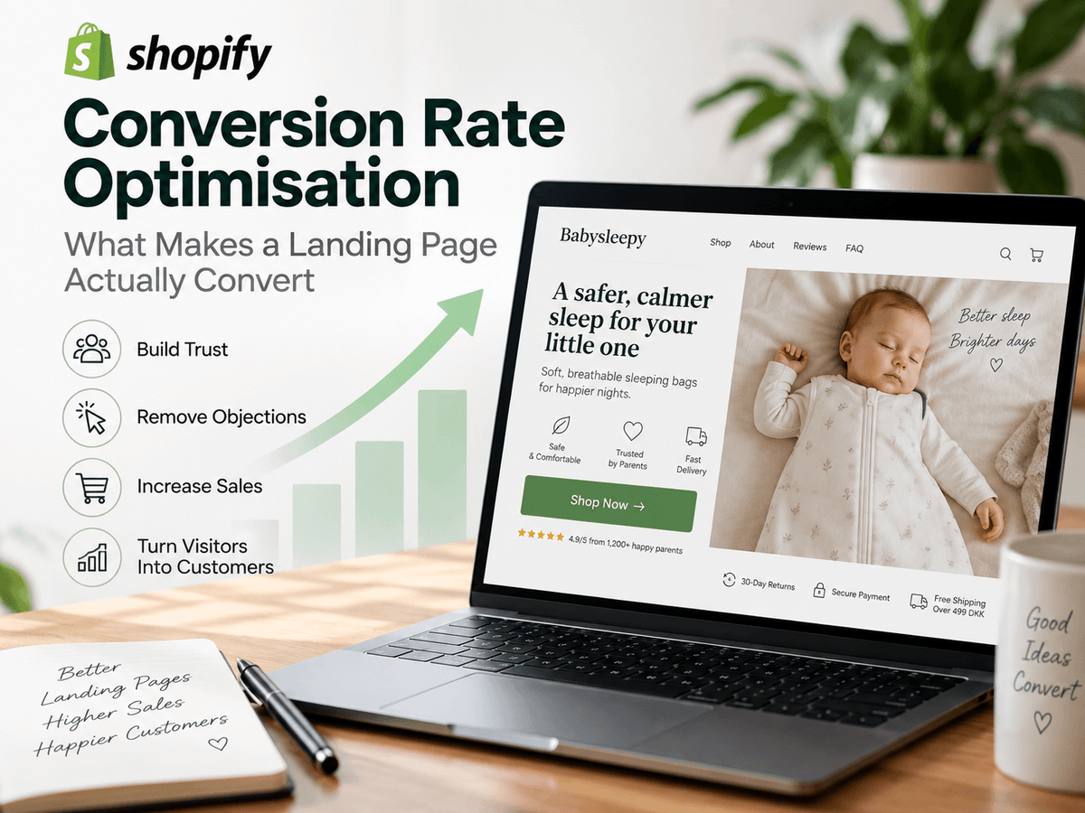
A landing page can look great and still fail to sell.
You can spend hours choosing colours, building sections, writing copy, adding icons, and making everything look professional. But none of that matters if the visitor lands on the page and still has the same questions:
What is this? Why do I need it? Why should I trust you? And why should I buy it instead of something else?
This is fundamentally a post about Shopify conversion rate optimisation — specifically, what actually moves the number on a product landing page. If you're looking to increase your Shopify conversion rate, the landing page is usually where the problem lives.
The goal is not to build the longest or most impressive page. The goal is to remove the reasons someone might have for not buying.
And that starts before they even scroll.
The honest framing
Most of what's in this post comes from running Babysleepy.dk — a Shopify store selling baby sleeping bags to parents in Denmark and beyond. It's a single-product-category business built around a small range, with Meta as the primary acquisition channel. The landing page decisions I'm describing aren't theoretical. They came from watching what actually changed conversion, what didn't, and occasionally what made things worse.
That context matters. A baby product sold to parents on Meta has specific trust dynamics — the customer is emotionally invested, often sceptical, and making a safety-adjacent purchase decision. Some of what I describe here will transfer directly to your store. Some of it will need adapting. Where the principle is general, I'll say so. Where it's specific to this kind of product and channel, I'll say that too.
TL;DR
Most landing pages fail above the fold, not below it. Fix that first and most of the rest follows.
If your first screen doesn't make the product immediately understandable, show it in a real context, and establish some form of social proof — the visitor has already decided to leave, even if they haven't scrolled yet. Everything below the fold is only doing its job if the visitor cared enough to get there.
This post explains the structure I use on Babysleepy.dk, drawn from direct experience running Meta ads to a Shopify product page and iterating on what changed conversion. It covers what to put above the fold, how to sequence the argument below it, how to use your ad creative as a research tool for your page copy, and how to handle trust, objections, urgency, and offers without undermining the thing you're trying to build.
The most important caveat: this is a single-product DTC store sold to parents on Meta. The principles are broadly applicable. The specific examples are from that context.
A practical Shopify landing-page structure
Before going into the reasoning behind each decision, here is the structure I'd use if building a product landing page from scratch. The rest of this post explains why each section exists and what it needs to do.
- Hero / above the fold: Clear product, primary benefit, strong imagery, social proof signal, price or offer, and call to action.
- Problem and value proposition: Make the customer recognise the problem and understand how your product addresses it.
- Product in use: Original lifestyle photography showing relevant people actually using the product.
- Benefits and differentiation: Explain why this solution is different from the alternatives and why those differences matter.
- Deeper social proof: Customer reviews, photos, UGC, testimonials, or other genuine evidence.
- Objection handling: Address the concerns you've learned from customers and paid-social testing.
- Offer: Make the value of purchasing clear, including any genuine saving or additional benefit.
- FAQ: Answer the remaining questions that might prevent someone from ordering.
- Final CTA and genuine urgency: Give the customer a clear next step and, where appropriate, a legitimate reason to act now.
The exact order will vary by product. That's fine. The objective isn't to follow a template perfectly. It's to understand what information your customer needs before they're comfortable buying.
Above the fold matters more than you think
"Above the fold" simply means everything a visitor can see before they start scrolling.
This is some of the most valuable space on your entire landing page.
Think about what happens when someone clicks one of your Meta ads. They probably don't know much about your company. They might never have heard of your brand before. They have not walked into a physical shop, spoken to you, picked up your product, or examined it themselves.
They've gone from an ad to a screen.
Your first job is therefore not to tell them everything. It's to give them enough information to make them want to stay.
Ideally, above the fold should answer several questions very quickly:
- What is the product?
- Who is it for?
- What problem does it solve?
- Why is it different?
- Can I trust this company and this product?
- What do I do next?
You have limited space, especially on mobile, so you won't necessarily fit every argument there. But the strongest ones should be difficult to miss.
Trust should appear early
For ecommerce, I consider social proof one of the most important landing-page elements.
The reason is simple. Your visitor cannot physically inspect your product.
Imagine you're selling a baby sleeping bag. A normal product photo can show what it looks like. That's useful, but it still leaves distance between the visitor and the product.
Now show a mother holding her baby while the baby is wearing the sleeping bag. Suddenly there is context. The customer can imagine the product in their own life.
Then add a genuine five-star customer review explaining something meaningful: perhaps what problem the customer had, why they bought the product, and what their experience was after using it.
Now you're doing more than showing a product. You're showing evidence that another person had a reason to buy it.
This kind of social proof doesn't necessarily have to sit in a large review section halfway down the page. You can integrate it directly into your product imagery or place a short review close to your primary call to action.
I want the visitor to encounter trust before they have to go looking for it.
Don't just show the product. Show someone using it.
If possible, organise a proper photoshoot for your product.
You don't necessarily need an enormous studio production. What matters is having original imagery that demonstrates how the product fits into a real customer's life.
This is particularly important when you're selling something where emotion, identity, comfort, lifestyle, or a specific problem influences the purchase.
If you're selling to parents, for example, don't only talk about product specifications. Think about the parent's actual situation.
Maybe they're exhausted because their baby isn't sleeping properly. Maybe they're dealing with an overstimulated baby. Maybe they've already tried other solutions. Maybe they're sceptical because they've bought products before that promised too much.
Those are much more interesting starting points for landing-page copy than simply saying your product has Feature A, Feature B, and Feature C.
You want visitors to recognise themselves.
Explain why your product is different
Your landing page does not exist in isolation.
Your customer can leave your site, search Google, open another tab, visit Amazon, check a competitor, or go back to Instagram within seconds.
So you have to answer an uncomfortable question: Why should they buy yours?
This doesn't mean writing that you're "the best" or covering the page in claims about being revolutionary. Be specific.
What does your product actually do differently? What problem does that difference solve? Why should the customer care? And why is that difference worth paying for?
If there is a meaningful comparison with the alternatives, show it. A simple comparison section can sometimes communicate more than several paragraphs of marketing copy.
The feature itself is rarely the important part. The consequence of that feature for the customer is what matters.
Your ad creative is telling you what your landing page should say
This is one of the most practically useful things I've done on Babysleepy.dk, and I don't see it discussed enough.
When you're running Meta ads, you're constantly testing different messages — different problems, different angles, different objections, different emotional hooks. Over time, the data tells you which ones resonate. Which angles get clicks. Which hooks generate comments. Which creative stops the scroll.
That's not just advertising data. That's customer research. And most stores don't use it.
Here's a concrete example. At one point I was testing two different ad angles for the weighted sleeping bag. One led with the product features — the weight, the materials, the design. The other led with the problem: parents of overstimulated babies who couldn't get their child to settle at bedtime.
The second angle outperformed the first significantly. More clicks, lower cost per click, better conversion downstream.
That told me something important. The customer wasn't primarily motivated by product specifications. They were motivated by a specific, exhausting problem they were living with. They wanted to know that someone understood that problem — and that this product was the answer to it.
So I changed the landing page to reflect that. The hero copy moved away from product features and toward the problem. The above-the-fold section opened with language that a sleep-deprived parent would immediately recognise. The review I surfaced near the top was specifically from a customer who described that same journey — tried other things, was sceptical, bought it, it worked.
The page and the ad were now having the same conversation.
That's the principle. Look at your strongest-performing Meta creative right now. What objection does it address? What problem does it name? What emotional hook does it use? Is that same conversation happening on your landing page — or does the visitor land somewhere that ignores everything the ad just told them?
If an angle consistently works in your creative, feed it into the page. The ad earns the click. The landing page earns the sale.
Reviews make the product feel real
I'd also set up a proper review system on the store.
For Shopify, a review app such as Judge.me can be used to collect and display customer reviews. The specific tool matters less than the principle: make real customer experiences visible.
When a visitor sees that other customers have actually ordered the product, used it, and taken the time to leave feedback, the product starts to feel less abstract.
This becomes even stronger when the reviews contain substance. "Great product!" is positive, but it doesn't tell the next customer very much.
A review explaining the customer's original problem, what made them hesitant, how they used the product, and what they experienced gives the next visitor something they can compare against their own situation. That's much more useful social proof.
One practical way to get more substantive reviews: your post-purchase email sequence. Instead of asking customers to "leave a review," ask them a specific question. Something like: "What problem were you trying to solve when you bought this, and did it work?" You'll get far more useful responses than a generic review request — and those responses become some of your best page copy.
Build your FAQ around objections, not filler
I consider an FAQ another important part of a good landing page.
But don't add an FAQ simply because landing pages are "supposed" to have one. Use it to remove friction.
Think about the questions people ask before ordering. How does it work? Which size should I choose? How quickly will it arrive? Can I return it? Is it suitable for my particular situation? What makes it different? How do I wash it?
Whatever the relevant questions are for your product, answer them before the customer has to send an email or fill out a contact form. Every unanswered question can become a reason to postpone the purchase.
A good FAQ also demonstrates expertise. If you understand the questions customers are asking and can answer them clearly, the business feels more credible.
For Babysleepy.dk, some of the most useful FAQ entries came directly from customer support emails. If the same question came in three times, it went into the FAQ. That's the fastest way to know what's actually creating friction.
Give the customer a reason to feel they're getting value
Offers can also have a significant impact on conversion.
The obvious version is a discount — maybe an introductory offer, a bundle saving, free shipping above a threshold, or another genuine economic benefit to purchasing.
But an offer doesn't always have to mean simply cutting 20% off the product. The broader question is: Can you make the purchase feel like better value?
That could come from bundles, added value, quantity breaks, gifts, shipping, or other genuine benefits. The framing matters because customers don't evaluate price in isolation. They're evaluating what they receive in exchange for the money.
One thing I would avoid is inventing a fake saving by manipulating the comparison price. If you're presenting something as a discount or saving, there should be a legitimate basis for it. Trust takes much longer to build than it does to destroy.
Urgency works — but only use urgency you can stand behind
Urgency works because people don't like the feeling that an opportunity might disappear.
If a product genuinely has limited stock, communicating that can give an undecided customer a reason to make the decision now rather than next week. The same applies to a genuine time-limited promotion or a product experiencing unusually high demand.
But there is an important distinction between communicating urgency and manufacturing fake urgency.
If you're actually running low on stock, say so. If an offer really expires, make the deadline clear. If demand really is affecting availability, communicate it.
I wouldn't put a fake countdown timer on a page that mysteriously resets every time someone returns. I wouldn't tell customers there are "only 3 left" when there are 300 sitting in the warehouse.
You might gain a conversion. But you're building it by sacrificing the thing the rest of your landing page is trying to create: trust.
The landing page should answer objections in the right order
Don't think of a landing page as a collection of Shopify sections. Think of it as a conversation.
At the beginning, the visitor needs enough information to become interested:
This is what it is. This is what it does. This is why it might matter to you. And yes, real people have bought it.
Then you can go deeper:
Here's how it works. Here's the problem it solves. Here's why it's different. Here's what it looks like in real life.
Then deal with uncertainty:
Here are customer experiences. Here are answers to common questions. Here's what you get. Here's the offer.
And finally:
Here's why it makes sense to act now.
That creates a much more logical landing page than simply installing a theme and filling every available section with content.
Frequently asked questions
What is Shopify conversion rate optimisation?
Shopify conversion rate optimisation is the process of improving the percentage of visitors to your store who complete a purchase. It covers everything from landing page structure and copywriting to trust signals, offer framing, and checkout friction. The landing page is usually the highest-leverage place to start — specifically everything above the fold.
How do I increase my Shopify conversion rate?
Start above the fold. Make the product immediately understandable, show it being used by someone your customer can relate to, and get a genuine social proof signal in front of the visitor before they have to scroll. Below the fold, continue answering the questions standing between the visitor and the purchase. Use your Meta ad data to understand which objections and pain points resonate most — then make sure the landing page is addressing those same things.
What's a good conversion rate for a Shopify store?
It varies significantly by product category, price point, traffic source, and audience temperature. A visitor arriving from a branded search or an email list will convert at a much higher rate than cold traffic from a Meta ad. As a rough reference point, most Shopify stores see overall conversion rates between 1% and 3%, but that number is less useful than tracking your own baseline and measuring what specific changes do to it.
Does landing page structure really affect conversion rate?
Yes — and the structure matters more than most store owners realise. The sequence in which you present information changes how a visitor processes trust, value, and urgency. A page that leads with features before establishing trust will convert worse than a page that earns belief first and then goes deeper. The nine-step structure outlined above is a practical starting point, but the underlying principle is simple: answer the right questions in the right order.
The bottom line
You can build an enormous Shopify landing page with beautiful design, animations, icons, comparison tables, FAQs, and dozens of reviews.
But if the first screen doesn't make people care, much of that work is wasted.
Start above the fold. Make the product easy to understand. Show it being used. Establish trust early. Explain the problem it solves and why it's different.
Then use the rest of the landing page to deepen that argument.
Use your Meta creative data as a research tool for the page. Address the pain points that resonate. Show real customers. Answer objections before they become friction. Give people a compelling reason to buy and, when it's genuine, a reason to buy now.
A converting landing page isn't really about adding more sections. It's about understanding why someone would buy, why they might not, and systematically closing the gap between those two things.